NEW YORK IN QUARANTINE, A PHOTO BOOK
By: Eddy Ymeri
06/14/2020
Category: Typography
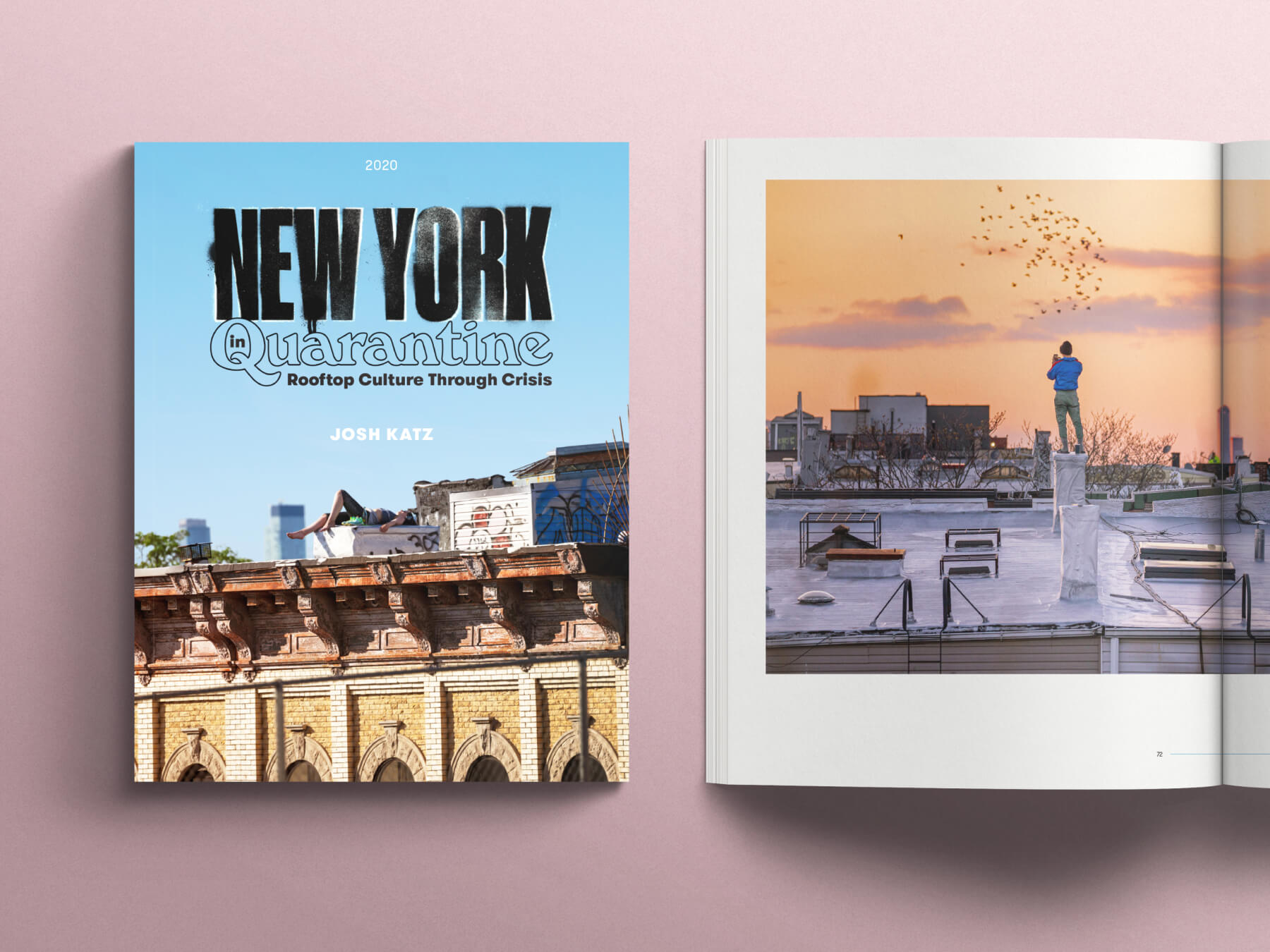
Created during New Yorker’s 2020 quarantine: persevering through a state of detention, all photographed from Josh Katz Bushwick rooftop.
Being cooped up in my Chicago apartment and living with my thoughts, I struggled to work when there has been so much turmoil happening around me. Luckily, I caught wind of a New York photographer releasing a book about his experience and I knew this was something I could get on board with. This is a photobook for charity, with 100% of profits directly to Doctors Without Borders.
This is not a boring, minimalist photo book.
I had the honor of working with Josh Katz and designing his latest book, “New York in Quarantine: Rooftop Culture Through Crisis”.
The challenge —
“This is not a boring, minimalist photo book meant for photographers. It’s a coffee table book that anyone with an emotional connection to NYC could appreciate. In fact, anyone that was alive during 2020 could appreciate the way in which Josh captured the strangest summer. Clean + Simple Design, but not lazy minimal. Efficient minimal.”
The book requires us to explore the boundaries of being in quarantine. Our goal was to showcase Josh’s photos in the Spring of 2020 when the pandemic forced a “stay at home” ordinance.
There was a first draft Josh created using an online “do it yourself” service. Images were placed in a preliminary draft of the book without text. When I got involved we dove right into how to push ourselves and tell a story through his camera lens. We needed to marry the notes he had created while showcasing his photos through his social media outlets. Josh wanted to expand upon his experience during quarantine and his escape to his building’s rooftop for a creative outlet.
How do we show more of a human experience through his work in a book form?
Timeline —
Our first zoom conversation began in mid-September. Our goal was ambitious; we wanted to release a sample of the design in early October to begin initial crowdfunding. We would continue designing while Kickstarter was open for 30 days. Our hopes were to have books out and in the hands of our buyers in time for the holidays. Spoiler alert: while logistics and scheduling is not a fun topic to write about, let’s just say we were a bit too ambitious. Josh found support through his skateboard sponsorship to package and ship books at a deal that would get more bucks to the charity. A better way to go, but unfortunately holiday sales would not be on the table.
Beginning —
A central theme of the book includes representing the aesthetic of the neighborhood, Bushwick, where Josh took photos from his apartment rooftop. Throughout the book, I also wanted to convey the rich human connection that can only be found through the people that make up a neighborhood: corner store owners, barbers, bodega owners, loiterers, and food stand owners.
We decided to incorporate all of Josh’s writing in the book design — looking for patterns in his writing and how to pair it with photographs and being explicit.
Process —
The first step was to figure out the story’s flow and the elements we wanted to use given our tight timeline. After the initial rush of getting design samples, it led to discovering other possible layout options by moving and reviewing shapes around a spread to get an idea of photo placement.
With a printout of images placed next to Josh’s first draft, I began to look for patterns of images but the order sequence didn’t come together initially. It took Josh pairing his writing with the images that he felt would work best. I had to rethink Josh’s initial positioning from the first draft and create a new visual flow — typefaces, color palette, grid, layout, and graphics: all of which would make up this physical book.
While waiting on content, I was sketching and drafting up ideas for the cover artwork. I know about Bushwick, and the rich graffiti culture it has. I needed the cover to represent Bushwick’s street art but still give off an inviting feeling of connection that is captured through the writing in the book.
The Typeface used was Druk Condensed by Commercial Type for its extremely tight characters and Windsor Bold by URW Type Foundry shows up as playful and colorful. Touching on color and shapes, Josh and I were also inspired by American painter Stuart Davis’ work and jazz studies.
Combined with a hand stencil, the post edit was staged well with Josh’s rooftop portrait of someone laying down gazing up at the infinitely blue sky. Once I had a clear vision of the cover, type rules, grid, and text, I was able to place each page quickly. In just 2 months we went from concept to final print production.
End —
Josh decided to work with a California print company, Edition One Books. As I write this, we’ve sent out a draft proof file for calibrating colors. We’re excited about getting our hands on a sample. Edition One Books really know their stuff- they are a super helpful online resource with measurements and dimensions to design your book.
The good —
I’m proud to be a part of this project which donates 100% of their profits to Doctors Without Borders. Profits will support their work fighting COVID-19 and providing humanitarian medical support to destabilized regions worldwide. In under 48 hours, our book exceeded the funding goal of $10,000 on Kickstarter.
At the moment, The book helped reach a two-goal stretch of $30,000 that profits will be donated to Doctors Without Borders and hopes to raise more in the future. Since this push is all about raising more money for charity, it’s a warm feeling for helping make a difference.
Reflection —
During the months we worked on the book, it was at a fast pace. Our conversations could last for hours: reviewing layout, talking through every little detail, scheduling and staying on track of milestones. Fortunately for us, we had WeTransfer for helping us exchange large files and we had numerous Google Docs with lots of rounds of copy edits and notes.
There were several eyes on the book during our process, which made it difficult to drop the final copy. I’m not a strong writer, so I really did appreciate the added support.
It’s hard when there isn’t the proper length of time given to sit with and digest the work. Rushed lends itself to mistakes or details overlooked. I’m sure many can relate, I hope to find a place to correct time in my workflow.
Final thought —
I thank Josh for trusting my process, allowing me to visually tell his story. The reaction of allowing me to go with my instincts on what the book needed and listening to me rationalize what we are doing and the why.
I also thank everyone else who has purchased a copy of our book. Please be cautious, respectful, and maintain social distances while still needed.
Information
Dimensions: 9” x 12” inches
Method: Softcover, perfect bound
Pages: 96
Printing: Digital
Credits
Photography and Writing: Josh Katz
Book Designers: Eddy Ymeri
Editors: Ellen Cranley and Kyle Wright
Introduction Illustrator: Danette Gomes
