ALGARDI,
CREATING A NEW TYPEFACE
By: Christian Ortiz
08/15/2020
Category: Typography
While designing the new website for our creative studio, All Day Dreaming, we began to explore a variety of typographical choices and solutions to use for our headers and display language.
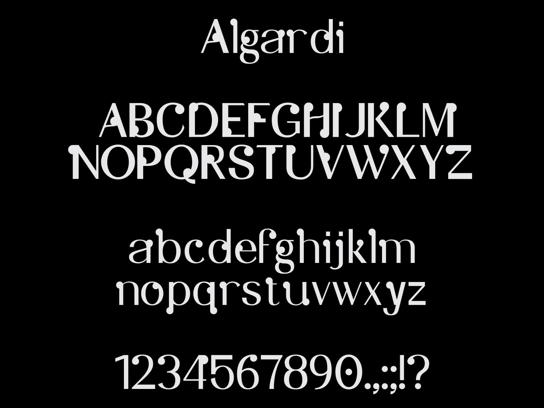
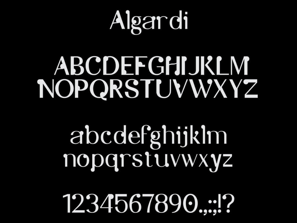
Over the course of about a week of testing and making up our minds, we decided to stick to simple using the trusted and well designed type family, Suisse Int’l. As lovers of design, typography, and the process that those entail, it felt right to create something of our own. Wether we decide to use it in future site updates/versions, it felt right to begin to explore our own ideas and how we could begin integrating them into our own identity. With all of this in mind, we began exploring the ideas and studies of creating our own typeface, Algardi.
Inspiration
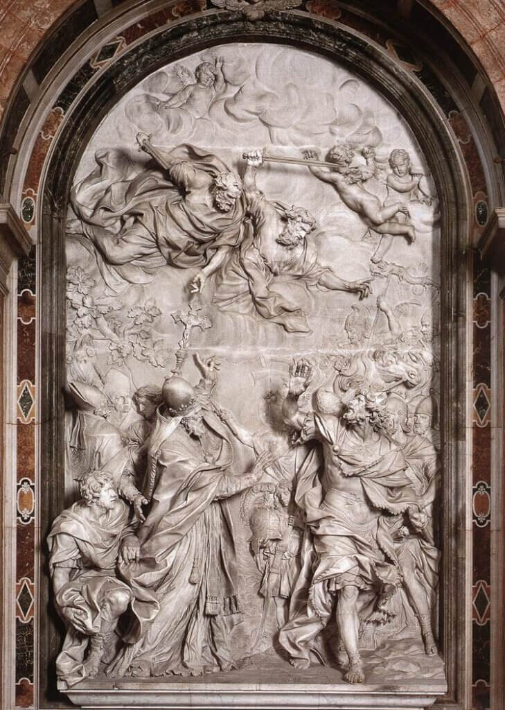
During a trip to Milan, Italy in September 2014, All Day Dreaming designer and creative director, Eddy Ymeri came across a sort of plaque that had been hand-painted with custom lettering for the sculpture/art piece above it.

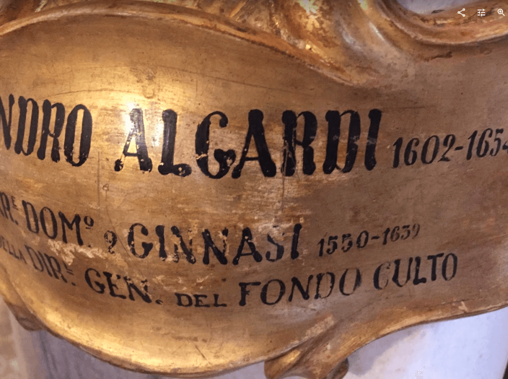
The hand-painted lettering read “Alessandro Algardi, 1602–1654,” in a large condensed characters. Underneath that there were other phrases/writings that unfortunately, we have not been able to identity ourselves.
Our focus and main inspiration was that the original designer/letterer made use of only using uppercase characters and small caps. Along with those main interests, the decisions and design choices of using bold stems, thin counter widths and ellipse like serif’s of these contrasting letterforms drew us in to what these future typographic letterforms could be.
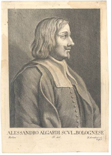
Though not much is known about the lettering, its origin, or the painter of this specific plaque, we were able to find some historical information and pieces of work for Alessandro Algardi himself.
Alessandro Algardi (1602–1652) was an Italian high-baroque sculpture and architect who almost exclusively worked in Rome, Italy. Algardi’s tedious and extremely detailed work/practice seemed to explore the re-creation and storytelling of religious individuals, history, and scenes of which you may or may not know(we’re not so familiar ourselves).
Through own research and investigation of the work completed by Algardi, we began to understand and notice parallels between stone carving and type design. We studied the characteristics of sharp edges, smooth chiseled details, and the contrast throughout each one of his sculptures that we examined. Similar to stone carving, type design focuses on the initial phases of mapping out what you are looking to create, the carving/molding the forms themselves and finally polishing the details toward a finished design.
Process
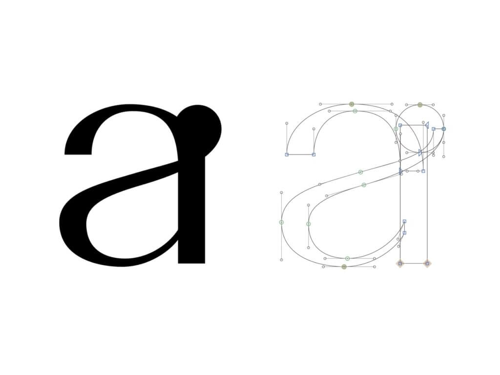
At the beginning stages of designing Algardi, our first initial thoughts were to just to start through the process of digitizing the current state of those letterforms. Though this seemed to be a chance for us to expand on the unknown, the what ifs, and how we as designers could make this into something new and our own typeface. We decided to push forward by starting from “scratch.” We began our sketches by utilizing pen to paper methods and with some helpful tips by this sketching tutorial on the Glyphs App website. There were many other tutorial videos and readings that were helpful throughout the whole design process. *View our references and notes for links to those.
During the sketch phase, we made sure to take some time to explore past and current typographic styles and ideologies that we were interested in for Algardi. While taking a deeper dive into those typefaces, we found ourselves focusing on three main styles of typefaces: Grotesque, reverse contrast/stressed, and wood type.
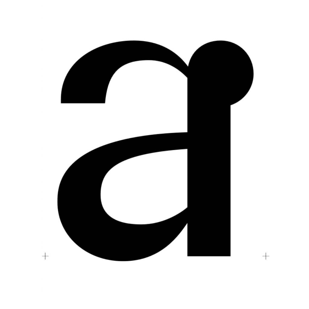
Interested in designing a typeface that could be used primarily as a display typeface for headings and at large sizes, we began to explore the widths and characters that were necessary for this usage based on the three main styles that I have previously mentioned.
Rounded spurs/serifs, bold to think weights, and overall contrast began to come together as we “carved” away at the digital designs and fine details of the forms.
I do not believe that there is a specific style or design of typefaces that Algardi can be simply categorized into. We never really decided what this was going to be in its final outcome. We still really haven’t since this is for now an ongoing project.
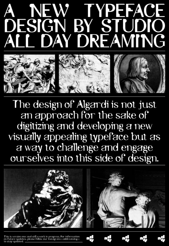
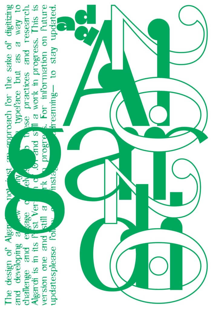
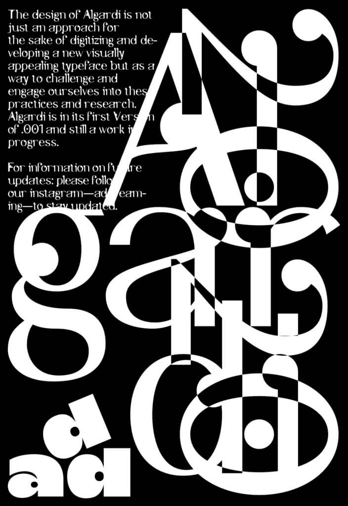
The design of Algardi is not just an approach for the sake of digitizing and developing a new visually appealing typeface, but as a way to challenge and engage ourselves into these practices, interests, and research.
References and Notes
- Algardi Regular is its first Version of .001 and still a work in progress. For information on future updates and release plans, please follow our Instagram(@addreaming) to stay updated.
- We used Glyphs to help develop and design Algardi Regular.
- We have done our best to find and make note of any information or background of the painters/lettering originator(s). Unfortunately, we have not been able to track down any (for now).
